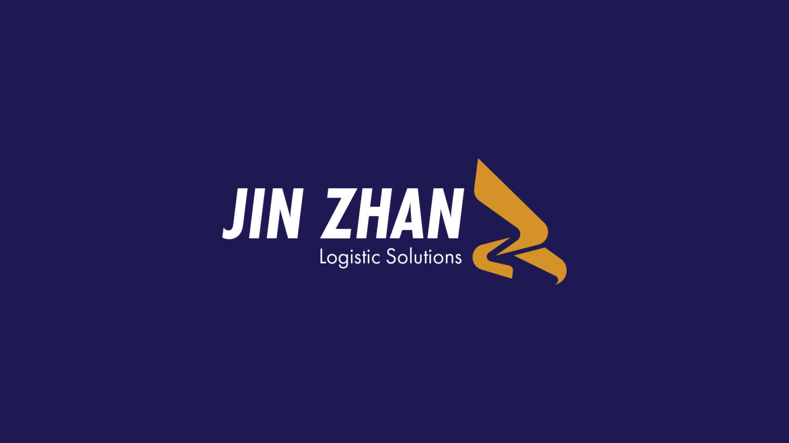
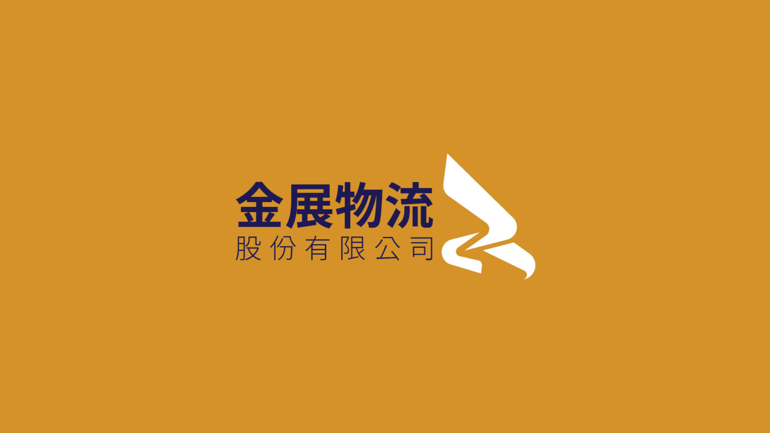
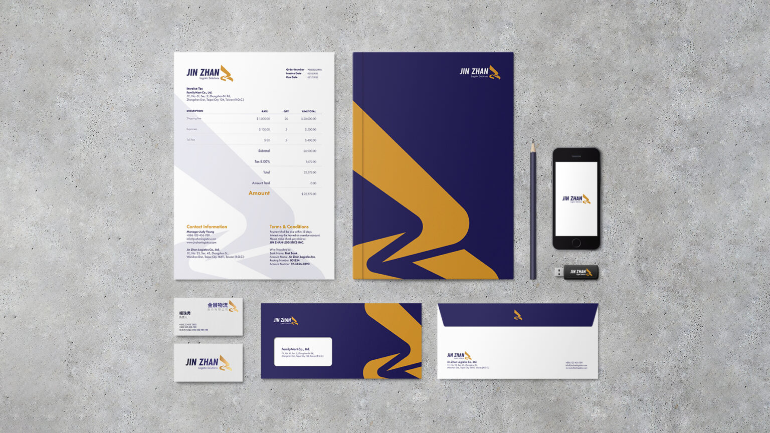
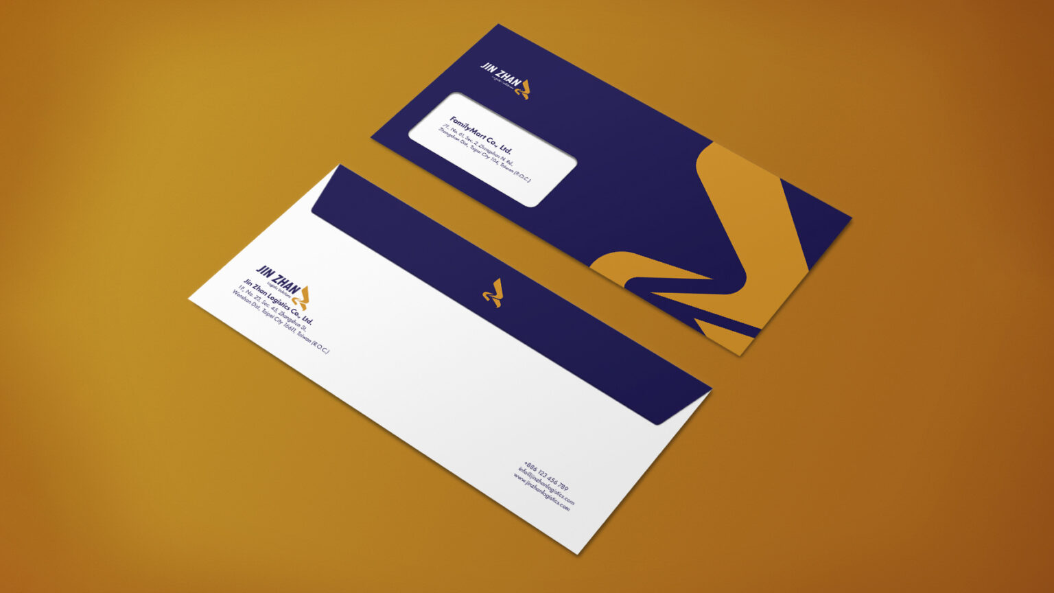
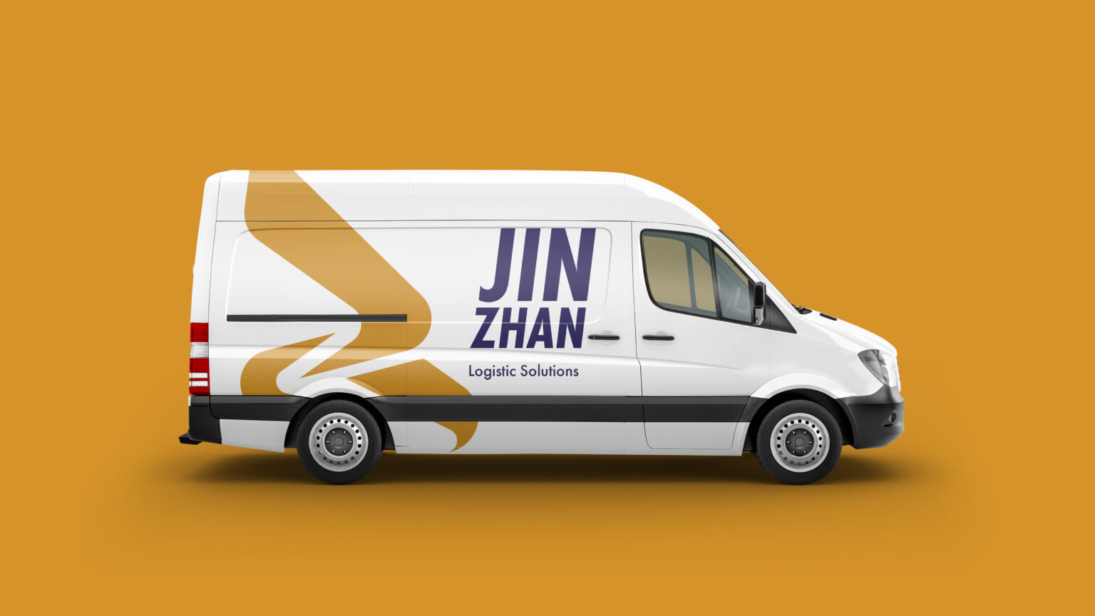
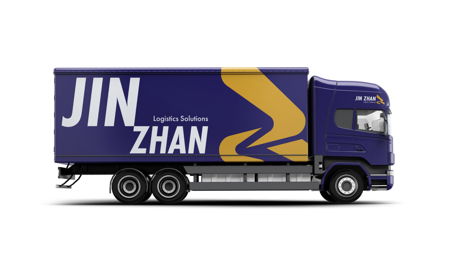
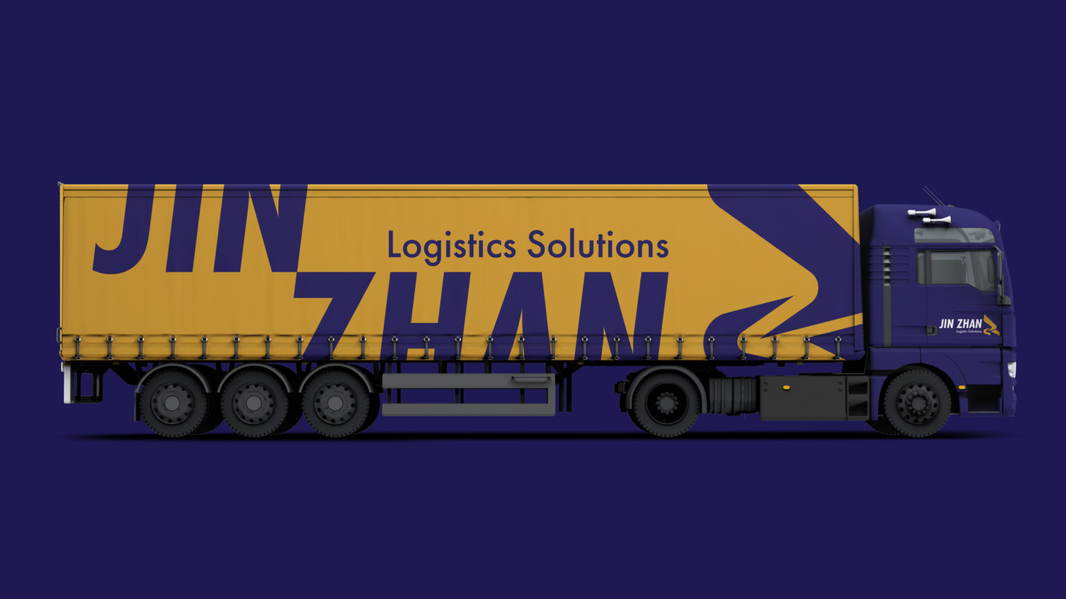
The project is designed for a logistics company called “JinZhan Co., Ltd” based in Taipei, Taiwan. Logistics is an industry with high pace, puncutality, precision and ability to tackling with various delivering situations and process; briefly, the company identity must embody visually with features such as fast, accurate, and self-discipline to show its efficiency and performance.
The identity designed for the company is inspired by hunting actions from an eagle with merging the initial letter of JinZhan. Tilting letter J and Z depicts the shape of an eagle which builds a dynamic and speeding sense like diving from the sky. The negative space between letters forms an arrow and points to the company name.